
Second: This is a really long post!! I did a lot of sketches and prelim work for this month's picture book report piece so I'm just dumping it all here! Apologies for the extensive Sabriel-jargon and analysis, I don't blame you if you just skip through to the pictures. ;)
Third: Sabriel! Whew, a bunch of false starts this month! You can check out my little narrative post at The Picture Book Report.
I was having a really hard time deciding what scene I wanted to do next...Sabriel runs away from the Mordicant, she gets to Abhorsen's house, meets Mogget, and sets out in the paperwing. All really cool things I'd like to draw! In the end I probably chose the least narratively-involved thing to draw, but I needed a bit of break from all these dark, intense scenes.
When I was trying to decide what to do I made a bunch of super-quick thumbnails from different scenes in the book I was interested in. I then narrowed down the total 12 (or 11, since I missed a week) that I'll have done in the end...super hard, there's so much cool stuff! I don't think I'll give anything away by posting these because my sketching and handwriting probably look like chickenscratch to anyone else:
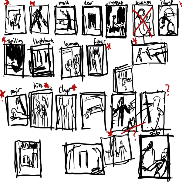
I was still struggling between drawing Sabriel and the Mordicant, or something involving Mogget at Abhorsen's house, OR the scarier form of Mogget Sabriel encounters a bit later on...I decided not to do the Mordicant, since it will show up in an illustration later, so I thought maybe the Free Magic version of Mogget would be fun (he's kind of a big lighting-monster!) I ended up with this color sketch:

But the colors weren't working, and the pose was so-so after a million revisions and I was just feeling stuck. I decided to set it aside and try a different subject. However, in the process of making this sketch I had to work out Sabriel's Abhorsen outfit. As I've pointed out before, I really love researching into illustrations and I wanted to be accurate to the book's description of her wardrobe as well as realistic to similar medieval counterpoints. Here's the different pieces of the outfit, in the order they are layered:
*A thin cotton-like undergarment
*Baggy drawers
*Linen shirt
*Doeskin tunic
*Supple leather breeches, reinforced with hard segmented plates at the thighs, knees and shins (and a padded bottom for riding)
*Long armored coat, buckled at sides--knee-length split skirts, swallowtailed sleeves, made of interlocking ceramic/stone plates, like a fish's scales.
*Hobnail boots (guessing they came from Ancelstierre since they're more modern)
*Blue surcoat with embroidered silver keys
*Sword belt and bandolier, with a helmeted turban
Whew! Lots of stuff, eh? Well, in the end a lot of the layers wouldn't fully be shown, like the tunic or shirt, but I like the idea of knowing that they all exist and what they look like together. Here's my sketchy thoughts:
 Because I was lazy I didn't put the keys on the surcoat or the plates on the armored coat on the right hand side
I made sure the armored coat and the surcoat were split up the front and the back, because side slits (though sexier) are of no use when riding a horse, and the book points out that her pants are padded for riding. Medieval surcoats in general seem to be sleeveless, or have very short sleeves (probably so they don't get caught while you're flingin' your swords) so the sleeves of her armored coat would be sticking through--probably with a bit of her linen shirt showing at the neck and wrists. I also kept the neck of her doeskin tunic up high, for a bit of extra protection around her neck where the armored coat might chafe. I think the idea of the pants are pretty cool with the sewn in armored plates, even though they're not seen much--it made me think of the overlapping layers of a samurai's armor. Hobnail boots seem to come up around the mid-calf region, so plating in the pants would have to end around there.
I decided not to have Sabriel at all in this month's piece, but at least my rough guide will be helping me in illustrations to come!
Instead, I was charmed by the idea of taking a break and giving Mogget & Abhorsen's House their own illustration. I did many bad sketches, or starts-of-sketches. Some of them started working better:
 Mogget by the front door, Mogget in the study, Mogget at the end of Sabriel's bed
 Abhorsen's house with Mogget at the front door
I liked the close-up drawings of Mogget that I did, but I thought drawing the house's exterior and doing something brighter and more architectural would be a nice counterpoint to the figure-dominated pieces I've been doing. Plus, I like looking for excuses to use the white of the paper in a spot-type piece, and the whitewashed exterior of the house would be perfect for that. (We have a great Battaglia book here that's a big inspiration for that sort of style). I wanted the house to be a safe-haven (and typical of mishmash medieval architecture), but still a little ominous. Here's the resulting final:

Geez, if you guys stuck around and read even half of that you deserve a pat on the back!! I always really appreciate your comments, and if you want to weigh in on the outfit or Mogget or how I write too much I would encourage it. :)
SABRIEL, as always, is copyright Garth Nix.


