Tuesday, June 21, 2011

Bad Teacher

Thanks so much for all the kind responses for my 1200 poster!! In contrast to that epic project, here's a recent quickie-- I have an illustration out in this week's New Yorker! I had a weekend to make an illustration based on Cameron Diaz's new movie "Bad Teacher". Jordan Awan, my art director, just wanted it to be a fun image showcasing Cameron & Justin Timberlake.
My sketches:

And final!

Justin's likeness gave me a little difficulty (he's just like a generally good-looking guy!) but overall it was quick and painless and fun and summery! I've been working on a lot of assignments with long deadlines, and sometimes it feels nice to just bust an image out in a few days. I do think it was pretty neat that I was drawing a sexy woman spraying herself with a hose for the New Yorker, of all magazines. Thanks for the opportunity, Jordan!

Sunday, June 12, 2011

1200 Posters!


Meet my new favorite drawing!
A while back I was contacted about contributing to 1200 posters--a project about community that features a new artist & poster each month, using quotes from Margaret Wheatley's "Turning to One Another".
I haven't had a chance to do a poster in a loooong time, and Robyn Ng & Greg Kozatek, my art directors, were pretty open to whatever idea I wanted to draw. (woohoo!)
The poster is limited to an edition of 100, only $25 each, and you can read more/buy/check out the other posters here! In my artist statement there I talk a little about the importance of the illustration community (which includes you guys!) & some of the ideas behind my poster.

If you are interested in hearing me ramble more about process, read on!

The quote I was given:
"Invite everyone who cares to work on what's possible"
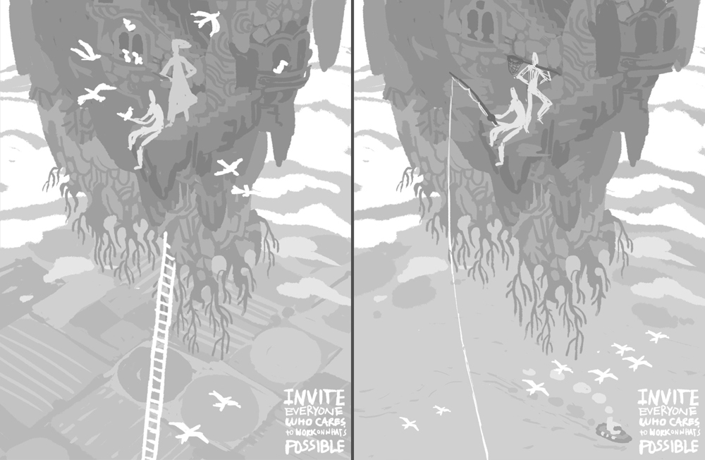
This put me in mind of intrepid adventurers, and since the theme was so open I ended up deciding to try and combine a lot of the stuff I love into one image:
*Secret, hidden places
*Trees, plants, moss
*mAgIc/fAnTaSy
*Adventure!
*Ruins
*Cats
*Old-timey explorers
*Birds, why not

My brain-funnel turned these things into an idea for a floating island/garden. Anytime I think of floating islands I think of Laputa (which is fine with me since Miyazaki is a god) but I figured that since the comparison would likely be drawn I definitely wanted to make this MY island with my spin on it.
The corresponding sketches:

Also, in a fit of worry that my floating island didn't fit the theme well enough & people wouldn't want to buy a poster of a sky rock, I did some sketches for a pretty girl poster too:

BUT Robyn & Greg liked the island and suggested that the type be integrated more and that the island look more like a nest that a bunch of people (and birds!) have built. So, we came to these options:

The sketch that was decided on takes some elements from each-- type in the background fields, thatching around some areas of the island, and some more homey touches like a clothesline, windows, etc.

From there I tried to work out a color sketch, which is probably one of the most important stages for me. Because I don't render out a lot of things in my work, I feel like I have to get the colors JUST RIGHT or else the image won't stand up. Also, since I work entirely digitally, once I get the color sketch right the rest of the work for me is just refining/polishing/redrawing straight in the color sketch until final.

This poster taught me that green is a heckuva difficult color to use well, and there's a reason why I don't often use it! Just a real pain. At least it feels damn good when you finally figure out a usable solution. Here's the general progression of the color that took me several embarrassing days to puzzle out:

no way

barf!

Finally!

I got pretty frustrated along the way and ended up looking at examples of other people using green well, then I extrapolated for my own purposes. I use reference for my drawings all the time, it makes sense to use color reference too.

As difficult as it was figuring out how to put a green island on top of green fields in the background, I was really happy to be drawing those background fields. They remind me of my family, some of whom used to be or still are farmers in Illinois. Another something I love in a poster full of things I love!

Anyway, here's a shot of the piece when it was aaalmost done. You can see there's some areas yet to be completed-- upper right, floating rocks, roots, text, etc. With this piece I did a lot of skipping around to ensure everything was worked up around the same speed:

The final is up at the top. Here's some closeups:


WHEW. While working on this, I realized that I need to work on drawing interesting characters, I don't feel as inspired drawing people anymore. Maybe it's like when every 7 years your body's cells totally renew and your tastebuds change? I've switched over to only wanting to draw backgrounds. Weird.
Thanks for reading, pals!!

Friday, June 3, 2011

Doughboys and Doughnut girls!

Happy National Doughnut Day, everyone!

I was catching up on my doughnut facts while I ate my free dunkin donut, and discovered the Doughboys and Doughnut Girls (also called "Doughnut Lassies") of WWI!
The Salvation Army sent their 'lassies' over to serve doughnuts and coffee to the homesick soldiers in the trenches (later called doughboys for their fondness of aforementioned treats). I couldn't resist doing a quick little doodle between all my REAL work. Enjoy your doughnuts!

Wednesday, May 18, 2011

Connections, The Sea, and Fate

I recently completed the July/August cover for Cicada magazine, and I'm really excited to show you. John Sandford, my art director, was my first-ever art director when I worked for him at Carus Publishing in Chicago as an intern/in-house illustrator during the summer between my sophomore and junior years of college. John also happens to be an extra-talented illustrator in his own right (check out his work here!), and understands that giving an illustrator creative freedom will often yield the best results. I love doing assignments for John. There were no rules with this job-- he only told me some of the general themes of the magazine for that month: Connections, The Sea, and Fate.

I wanted to try something different. I wanted to do something epic and fantastical. I wanted to take the style of my "just for fun" Game of Thrones illustrations and turn it into something that worked for jobs. I love editorial, but I would also love to illustrate more in other fields too (hey book publishers!), and I know that I can rise to the challenge.
My sketch. After looking at a lot of nature photos from old National Geographics (from this tumblr), I got really into the idea of a ruined seaside civilization. The cover image needed to wrap around and the back cover illustration had to be relatively free of distraction so text excerpts/callouts from the book could be placed on top of the image.

I thought of the girl as a traveler/descendant come to pay her respects and meet the last remnants of the civilization. Or possibly she is the last remnant. It sounds a little bleak, but I like the idea of intrepid youths carrying on ancient traditions, and I thought it fits with the themes of the magazine issue nicely. The final:

Final with cover text & address label area:

One thing I learned-- rocks are kinda hard. Kinda easy, but kinda hard. One day I will do some rock studies.
Thanks for looking! I hope to do some more illustrations like this in the future!

Monday, May 9, 2011

Parent=Parent

Hello friends!
I've been balancing a lot of longterm projects over here (hence the lack of updates for the moment), but I do have some exciting things to share now!
This weekend my long-labored Amtrak kid's activity book debuted on National Train Day, May 7th! I haven't actually gotten my hands on the physical copy yet, but I will be doing a blog post talking about all that very soon!
Also on May 7th, my cover for the Boson Globe weekend magazine came out! Big thanks to my art director Ryan Huddle for making it all come together.

The big theme for the cover was "Equal Parenting", as recently pioneered by Amy and Marc Vachon. And when I say "equal parenting" I mean TOTALLY EQUAL. Each parent gets a share of ALL the chores, for equal amounts of time (albeit on different days) and each parent spends the same amount of time at work and taking care of the kids, etc. Visually "equal parenting" gives you a pretty set concept to work with, so my sketches were in fairly similar veins, but different stylistically.

They chose the less-graphic sketch but requested that the background just be one color and that both the parents look like they're going to work.
I didn't feel totally satisfied with it until I added a lighting element. I've been really digging atmospheric lighting lately.

And the final after Ryan laid the text out (unfortunately compressed by blogger):

I had a good time with this one, and wish I had that scarf the mom is wearing. And the dad's lambchops!

Tuesday, April 26, 2011

An Emily, a Sarah, and two Adams!

Within the past three weeks, I've traveled down south twice to celebrate the weddings of 2 of my 3 wonderful Georgia cousins, Emily and Adam! (you're next, Jonathan!)
Emily got hitched with another Adam, and Adam got hitched with Sarah!
Sarah & I were bridesmaids in Emily's wedding, and Sarah suggested that I do a portrait or caricature of the bride & groom. I've always had a bit of difficulty with portraits, but lucky for me I had some good faces to work with :)


So, of course, when Adam & Sarah's wedding rolled around, I decided to do portraits of them too!


Both these sets of portraits were interesting experiments. When I tried to apply the same simplified style I did with Emily & Adam's portraits to Sarah & Adam's, I found that I needed to use a little more realism to get across the best resemblances. Different faces & personalities call for different styles, and I got some great practice out of it!

Wednesday, April 13, 2011

The Savoy Affair


Ever want to make a mixed drink, but cocktail recipes aren't illustrated enough for you?? Boy, do I have the free iPhone app for YOU! Loud Cloud Mixtures! The Loud Cloud, the creative agency that I'm a part of, recently put out a free app for your iPhone called Loud Cloud Mixtures! All of us artists in the Loud Cloud picked a delicious cocktail, and created an illustration based around it. It's a handy gallery of visually & gustatorily satisfying drinks at your fingers, featuring such drinks as Black Forest Martini, Dark and Stormy, Lynchburg Lemonade, Pink Elephant, The Negroni, and many more! Download it from the itunes store (for freeeee) here!

At first, I wanted to do the White Russian...I tried out some sketches, but nothing really felt right for me.

I looked into some more obscure cocktails, and found the Savoy Affair. What an intriguing name, right? It was one of 20 cocktails invented by Joe Gilmore, the longest running head Barman at the Savoy Hotel in London. (another awesomely named cocktail invented by Mr. Gilmore: the Savoy Corpse Reviver)
Anyway, "Savoy Affair" is just screaming for a mysterious summertime hotel rendezvous...and that's what I decided to draw (complete with a shady character watching from the background!)

I was able to realize it pretty quickly and easily, I think it's definitely one of my favorite recent pieces.