Friday, May 28, 2010

Abhorsen's House!

First off, I updated www.ciesemier.com with some new work! If you've been keeping up with the blog there probably isn't anything there to surprise you with, but if not check it out!

Second: This is a really long post!! I did a lot of sketches and prelim work for this month's picture book report piece so I'm just dumping it all here! Apologies for the extensive Sabriel-jargon and analysis, I don't blame you if you just skip through to the pictures. ;)

Third: Sabriel! Whew, a bunch of false starts this month! You can check out my little narrative post at The Picture Book Report.
I was having a really hard time deciding what scene I wanted to do next...Sabriel runs away from the Mordicant, she gets to Abhorsen's house, meets Mogget, and sets out in the paperwing. All really cool things I'd like to draw! In the end I probably chose the least narratively-involved thing to draw, but I needed a bit of break from all these dark, intense scenes.

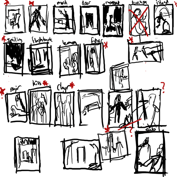
When I was trying to decide what to do I made a bunch of super-quick thumbnails from different scenes in the book I was interested in. I then narrowed down the total 12 (or 11, since I missed a week) that I'll have done in the end...super hard, there's so much cool stuff! I don't think I'll give anything away by posting these because my sketching and handwriting probably look like chickenscratch to anyone else:

I was still struggling between drawing Sabriel and the Mordicant, or something involving Mogget at Abhorsen's house, OR the scarier form of Mogget Sabriel encounters a bit later on...I decided not to do the Mordicant, since it will show up in an illustration later, so I thought maybe the Free Magic version of Mogget would be fun (he's kind of a big lighting-monster!) I ended up with this color sketch:

But the colors weren't working, and the pose was so-so after a million revisions and I was just feeling stuck. I decided to set it aside and try a different subject. However, in the process of making this sketch I had to work out Sabriel's Abhorsen outfit. As I've pointed out before, I really love researching into illustrations and I wanted to be accurate to the book's description of her wardrobe as well as realistic to similar medieval counterpoints. Here's the different pieces of the outfit, in the order they are layered:
*A thin cotton-like undergarment
*Baggy drawers
*Linen shirt
*Doeskin tunic
*Supple leather breeches, reinforced with hard segmented plates at the thighs, knees and shins (and a padded bottom for riding)
*Long armored coat, buckled at sides--knee-length split skirts, swallowtailed sleeves, made of interlocking ceramic/stone plates, like a fish's scales.
*Hobnail boots (guessing they came from Ancelstierre since they're more modern)
*Blue surcoat with embroidered silver keys
*Sword belt and bandolier, with a helmeted turban

Whew! Lots of stuff, eh? Well, in the end a lot of the layers wouldn't fully be shown, like the tunic or shirt, but I like the idea of knowing that they all exist and what they look like together. Here's my sketchy thoughts:
Because I was lazy I didn't put the keys on the surcoat or the plates on the armored coat on the right hand side
I made sure the armored coat and the surcoat were split up the front and the back, because side slits (though sexier) are of no use when riding a horse, and the book points out that her pants are padded for riding. Medieval surcoats in general seem to be sleeveless, or have very short sleeves (probably so they don't get caught while you're flingin' your swords) so the sleeves of her armored coat would be sticking through--probably with a bit of her linen shirt showing at the neck and wrists. I also kept the neck of her doeskin tunic up high, for a bit of extra protection around her neck where the armored coat might chafe. I think the idea of the pants are pretty cool with the sewn in armored plates, even though they're not seen much--it made me think of the overlapping layers of a samurai's armor. Hobnail boots seem to come up around the mid-calf region, so plating in the pants would have to end around there.

I decided not to have Sabriel at all in this month's piece, but at least my rough guide will be helping me in illustrations to come!
Instead, I was charmed by the idea of taking a break and giving Mogget & Abhorsen's House their own illustration. I did many bad sketches, or starts-of-sketches. Some of them started working better:
Mogget by the front door, Mogget in the study, Mogget at the end of Sabriel's bed
Abhorsen's house with Mogget at the front door
I liked the close-up drawings of Mogget that I did, but I thought drawing the house's exterior and doing something brighter and more architectural would be a nice counterpoint to the figure-dominated pieces I've been doing. Plus, I like looking for excuses to use the white of the paper in a spot-type piece, and the whitewashed exterior of the house would be perfect for that. (We have a great Battaglia book here that's a big inspiration for that sort of style). I wanted the house to be a safe-haven (and typical of mishmash medieval architecture), but still a little ominous. Here's the resulting final:


Geez, if you guys stuck around and read even half of that you deserve a pat on the back!! I always really appreciate your comments, and if you want to weigh in on the outfit or Mogget or how I write too much I would encourage it. :)

SABRIEL, as always, is copyright Garth Nix.

Wednesday, May 26, 2010

Mass Appeal

So for the April issue of Air Tran GO!, I did a couple illustrations for an interesting article on the power of crowdsourcing. Otherwise known as THE HIVE MIND!!
When I got the job, it didn't take long for me to get a sense of what I wanted to do--something vaguely reminiscent of a 1960's science textbook style, with bright overlapping colors and simple linework. GO! wanted some space for text within the illustration--the perfect spot for a giant lightbulb, given the illuminating qualities of the article (hohoho). Because I already had the general idea of what I wanted to do, all my sketches were variations on a theme:


And thus the final and spot:


Thanks for stickin'around! See you guys at the end of this week for some Sabriel work with a kitty innit! ALSO if you're interested in LOTR or the Hobbit (or just some sweet artwork based on it), check out this great blog post Irene Gallo put up on Tor.com, with a bunch of great artists and interesting contributions (including Sam!)

Wednesday, May 19, 2010

Spring Bloom!


So for the third in my series of lady portrait-type assignments, I've got this more realistic one for the LA Times! No sassy bra-ladies this time ;). Joey Santos came to me with an article in the weekend issue about spring tips and trends in makeup as told by Carmandy of What Not To Wear fame (I used to watch What Not To Wear all the time, to Sam's chagrin). The general theme was out with the old and in with the new and fresh, with a particular emphasis on floral colors like corals, pinks, and reds. I was feeling the zest of spring and wanted to do something light and airy with plants and flowers to signify the season.

The assignment turnaround was just 4 days from start to finish, so my sketches were necessarily brief. I had a little trepidation about doing the sketch that was chosen because I wanted the girl to look dreamy but not too silly, though I'm very happy with how it turned out.
Joey also suggested adding her other hand putting makeup on, and toning down the floral wreath-- a good call on both counts! I've been trying to expand my color palette to include some more neutral colors, so I wanted to limit my brights to just the pinks and reds spoken of in the article. Because the emphasis is on the face and the "prettiness" of it all, I really enjoyed going with a more realistic fashiony style. It turned out to be one of my new favorite pieces, I hope you like it too! :)

Wednesday, May 12, 2010

Feminist Porn Awards!

So here's a quickie for you in my line of lady-portraits-- I did the cover for the Toronto Eye Weekly highlighting the Feminist Porn Awards. They basically wanted to do a modern-style version of Rosie the Riveteer--in magenta glasses and a bra, holding the award statue. You got it!
The original Rosie:

My version:

Obviously mine doesn't transcend the original iconic piece, but it's my little homage. The colors are a little lighter in my version (since it prints darker on newsprint)...The tattoo was originally going to have info in the little ribbon, but it didn't happen in the end. I chose the axe for the tattoo because the doubleheaded axe was a symbol for the Amazons, and now for feminism and lesbianism. I love secret meanings!
Art Directed by the talented Taylor Shute-- www.taylorshute.com. Thanks Taylor!

Friday, April 30, 2010

There Had Been Too Much Death On This Hill

Hey guys! It's that time again...Picture Book Report Time! I've got another Sabriel piece to share! Check out my post at PictureBookReport.com to get a little more background on the story behind the illustration. I'm glad many of you enjoyed the previous Sabriel process post and I wanted to show the process for this one too.

I started out with the Cloven Crest sketches I had made previously and did some color comps for them...
...which made me realize it just wasn't that interesting to look at! I wasn't really excited about drawing it.

I decided to revamp and do something more focused on Sabriel and her encounter with Thralk. (I was a little sad I couldn't fit the broken charter stone in there though!) N.C. Wyeth's work has been blowing my mind and I've been looking at all his strong compositions--you can probably see the silhouetting influence in this!
I started with a bunch of quick crappy b&w photoshop sketches, trying different silhouettes and cropping. Once I found one I liked, I developed it more and tried a color option.


I wanted something spooky and cold and snowy, and finally settled on these colors:

I looked at a lot of reference for knickers, boots, and coats of the period. The coat she is wearing is one of her father's old hand-me-downs, and is only specified as "oilskin". Since Ancelstierre is vaguely 1920's, I figured her father's old coat could be a variation on the WW1 trenchcoats. I really love researching into illustrations, and I also spent a while sketching ideas for how her bell bandolier functions.(I think the bell handles would have to hang down, so they don't ring while she's walking)

I cleaned everything up and added textures and some digital painting to my usual flats. I wasn't expecting to put the red in there, but I really ended up liking it!

Voila! And here's some closeups!


Thanks for checking 'em out!

Friday, April 23, 2010

ToBoldlyFold + Family Circle DUBPOST

Hello friends!
So recently I've been doing a lot of portrait-type illustrations of women, which I'll continue to share in the next few weeks. They range from the more stylized (like below) to more realistic. It's been interesting trying to find different ways of doing them.

Family Circle magazine asked me to do an illustration about women's arthritis and joint pain for one of their March issues & I was happy to oblige! They decided later that it'd look good as a full page with room for text, which was easy for me to convert my illustration into.

I would've been happy doing either sketch, but it was interesting to be asked to do the simpler portrait since I feel I usually end up doing more complicated illustrations. (I drew her holding her wrist, because I'm super afraid of getting arthritis in my hands when I'm older!) The whole project was AD'd by Lisa Kelsey. Thanks Lisa!


In other news, Sam & I received a lovely care package of sketchbook goodies from To Boldly Fold! One of the perks of going to an art school is that you meet lots of other talented people who sometimes give you some of their great work, and we are lucky enough to know Mel Chao & Mark Grambau who generously sent us this parcel of high-end handmade sketchbooks. (check out Mel's other handcrafted sketchbooks at http://www.toboldlyfold.com and http://www.etsy.com/shop/toboldlyfold)
We each got a nice big leather sketchbook, and a couple of smaller varied ones!


The big sketchbooks are made with Rives BFK, hand cut genuine leather and a vintage button. This was all a total surprise to receive, and I LOVE the button and the stitching and the dark leather on my book, it fits my personality perfectly!! I also love how Sam's sketchbook totally matched with the shirt he was wearing that day (and his had dark green thread--his favorite!). My sketchbook is so nice I am honestly intimidated to draw anything in it. I hardly sketch traditionally anymore, but I'm glad I've got an excuse to now so I can post stuff to the ToBoldlyFold.com flickr website!


An extra bonus was that both books came with a sweet stick-on bookplate graced with the illustrations of our talented friend Nancy Muller!! (I got the bat!! I loveee himmm) I do not know how this girl doesn't have a prizewinning children's book out already.


Thanks so much Mel & Mark!!

Thursday, April 15, 2010

Hot Off the Press!

Hey dudes! It's been a while, I fell off the wagon a bit with blog posts last week because of taxes and busy-ness, but now I'm BACK and I have things to show you!

First up, I can't believe I haven't posted this yet, but this was done back in February for PLANADVISER's "Hot Off the Press" section...
It is AD'd by the charming SooJin Buzelli --I was happy to meet her and Chris Buzelli in person at the Heads for Haiti gallery opening last weekend.

I like the final, but had some trouble with the sketches....I had done a very straight-laced business illustration beforehand, and had some issues loosening up and finding a very non-literal interpretation of "Hot Off the Press". I think it worked out in the end, though (and taught me a good lesson!)

Sketches:


Final:


P.S. I found out that "Spring Awakening" piece from a few posts below got into Spectrum 17! Sweeeet.