Monday, July 19, 2010

Animal People & Bonus bogus logos

So! Getting back on the wagon train, I have a comic I did for Muse Magazine & the wonderful John Sandford! Muse sometimes has a 4 page myth-based comic (I previously did Hercules and the 12 labors for them) and John came to me with an Okanagan myth from the Pacific Northwest. The premise of the myth is about how the Great Spirit names all the animal people--they all have to come to his great lodge the next morning and pick their names, first come first served, and The Great Spirit will give each a job to do. Coyote is a trickster, and he schemes to stay up all night and be the first to receive his name (something grand like GRIZZLY BEAR or EAGLE) but all his scheming just causes him to sleep in and be the last to arrive. He is left with the name of Coyote, but also given the job of protecting the people of earth.

John suggested the totem-pole-like style, and I got to hand-letter the title as well!


ALSO, a while back I did a little piece for Inside Counsel magazine. It's a magazine for lawyers and people in the law department, and the article was about how campaign finance reform is changing & companies are now allowed to back political candidates. I thought of Nascar suits and all the advertising that gets crammed onto them, and applied the same principle to business suits. I had a fun time finding red-based logos and blue-based logos, and then twisting the names around so I didn't infringe on any copyrights. (Gatorate and Kol-Aid are some of my favorites) See how many you can recognize!!

Faux-logos always remind me of the awesome DVNO music video by Justice, enjoy!

Thursday, July 15, 2010

More Sketchbook

Hey guys! I'll get back to posting more finished work shortly, but I did these sketchbook pages over the last couple of days and figured I'd share them too. Like I said before, I'm trying to use my sketchbook more, and I think the trick is to get colored pencils involved in the situation...immediately more fun for me! Maybe it hearkens back to my childhood, plus it's fun to play with colors!

So, we've got a girl and her moth pet, because moths and girls are cool:

And a vaguely Mr. Darcy-ish man striding about with a tittering companion, plus a misty lady in her garden.

I suppose all these things stem from me currently reading the Song of Fire and Ice series (courtly-things, medievaly) and listening to the Harry Potter audio books while working (precocious youngsters and magic!). Yup, there you go. Despite what my editorial work may say to the contrary, I am a nerd who enjoys medieval adventure and magic kids.

Tuesday, July 6, 2010

You're such a prat Ron

So, not only have I been listening to the Harry Potter audiobooks while I work, but I bought the most recent Harry Potter movie from Blockbuster's store-closing sale. Yes, it's safe to say there's a Maximus of Magicus going around here, or whatever latin J.K. Rowling would translate that into. Sam and I watched the movie tonight, and I did some silly sketches during it. I don't show a lot of my non-professional work on this blog, and it's about time to start! Now you can see all the stupid drawings I do to make myself giggle.

Ron is just the saddest and goofiest character. Harry is the orphaned hero, Hermione is the "brightest witch of her age" (or so the author keeps reminding us) and Ron just blunders through everything getting the wrong idea and wearing sweaters with his initial on it. My salute to Ron.

Butter Beer looks delicious in this movie! Even Ron gets a mug (and a wonk hand)

For those who know Sam and/or would like to try and decipher my handwriting, I took quick note of some of our moviewatching experience. Sam is always ready with a snappy comeback, even when a movie is just going about its business.

Enjoy!

Tuesday, June 29, 2010

Carbo OVERLOAD

Hey guys! Who doesn’t love food?! I love being an illustrator, but cooking has been one of my new favorite hobbies, probably second only to eating. I recently got to do a piece for the Vegetarian Times, and I did a write-up on it for The Loud Cloud too! (it has all the same info as here, but its laid out nicer, hehe)

I don’t often get a chance to draw delectable dishes for an assignment, so I was excited to try my hand at this one! The article, “Carbs Demystified,” includes a lot of technical information about carbohydrates—good carbs vs. bad carbs, glycemic load, glycemic index, and net carbs. Part of the great thing about being an illustrator is that you learn a myriad of interesting facts from the articles you’re assigned (sweet potatoes have a lower glycemic index than white potatoes, despite their name!) but sometimes it’s difficult to figure out what the focus of the image needs to be. The A.D. on this story, Scott Hyers, helped me out by specifying that the illustration shouldn’t get into the technical info or define good or bad, but instead should just show a general choice between foods.

As someone who will spend 15 minutes deciding what type of cookie to eat, I understand the overwhelmingness of choice. Since there are amounts of carbohydrates in every food group, I figured a diverse representation of food would be the best way to go for my sketches. The food had to be all vegetarian, of course. I know there are different levels of strictness in people’s diets, so I checked with Scott to make sure I wouldn’t be in the red if I included egg or dairy products.

While sketching, I enlisted the help of my trusty cookbooks for some examples of tasty-looking dishes. I admit to being biased—all the food I sketched happens to be food I enjoy eating too! I liked the idea of a traveler finding his way through a jungle of food, and also tried some other approaches, like catching whatever meal you want on your plate. In the end the gastronomical explorer was chosen, and I set to work!

Throughout the project, I looked at my childhood doodles for inspiration. I’ve had a huge sweet tooth my entire life, and one of my go-to drawing subjects as a kid were various types of desserts. I was excited about bringing together kid-Kali and adult-Kali in one illustration! I remember drippy chocolate-glazed cakes and fruity cupcakes were some of my favorite scribbles to do, so I made sure to include an updated version of each in my final illustration.

Any time I deal with a lot of objects in one illustration, coming up with a solid color scheme is extra-important so all the objects don’t look too cluttered or disconnected. Colors like red, orange, yellow, and green have been shown to trigger hunger, and I wanted to go with a bright, summery feel. It took me a while to balance all the different food colors, but in the end I was pleased with the results. All in all a very satisfying project, with the only downside of making me perpetually hungry!

Friday, June 18, 2010

Sabriel Posts & the "God Molecule"

Hey guys! Wow, I've gotten a bunch of comments on my most recent Sabriel post! Thank you, I really appreciate all your thoughts and support--as I've said before, none of us at the Picture Book Report are getting paid for our work on this project, so hearing from you guys really makes it all worthwhile. I got a request to make it easier to find all the other Sabriel posts, so now if you scroll down the column on the right side of the page, you will find a section named "Labels" with a handy link to all the Sabriel posts! (I'm considering labeling all my other posts too, for easy browsing)

Okay! So it's way past time for me to get back to posting weekly pieces, right? The past month of so I was in a bit of a slump--feeling creatively burned out, wondering where my illustration/life/future is going, and having some mild health problems that just sort of added to the bad vibes. It seems common in creative-types to cycle between these on-and-off times. Resting and focusing on non-art pursuits (cooking! exercise! reading!) seems to have done the trick and I'm feeling better now and ready to go!

So, to put you in a good mood for the weekend, here's 2 spreads that accompanied an article about dying! ;P It was actually a pretty cool assignment from Tom Kachadurian, a great AD at Spirituality and Health magazine. The article talked about the use of a psychedelic drug, nicknamed the "God Molecule", to help people with terminal illnesses deal with their eventual death. Apparently the drug induces a hallucinogenic state where you feel totally at one with the universe and a higher power, as if you had died already, so the participants don't feel as scared of actual death anymore. Tom wanted to go for a swirly psychedelic look without getting too much of a 60's/70's vibe, and I wanted something calming and epic for such an intense experience.

My thoughts went to a galactic-type feel...like the participant is floating through the universe. It was a double-page spread, so I tried some different views with rich blues, whites and red/oranges (that I ended up combining in the end). I also tried an overlay of the human nervous system (approximate, at least), but Tom thought it looked a little too scary and skeletal.

I tried both a closeup and expanded view. With the expanded you get more of the calming, floating feel because you can see more of the body. I kind of like the head sketch on its own, but it does feel a more creepy than calming!

So, we end up with a space-goddess, with some swirling energy and a burst of enlightenment! I remember watching an X-files episode with aliens in it while working on this assignment. I wonder if there was some subliminal influence... Swirly marks come really easily to me, but once I go crazy with them I have refine a bit to ensure there isn't a distracting amount of swirls or strands or colors! I tried to go for a more watery look, like ripples and eddies of energy.


In addition to doing the space-goddess spread, I also did some edging on the following two pages. I actually really like the spread I created for these pages, it's simple but I spent a while balancing everything.


I hope you like 'em! Thanks to Tom Kachadurian at Spirituality & Health!

Friday, May 28, 2010

Abhorsen's House!

First off, I updated www.ciesemier.com with some new work! If you've been keeping up with the blog there probably isn't anything there to surprise you with, but if not check it out!

Second: This is a really long post!! I did a lot of sketches and prelim work for this month's picture book report piece so I'm just dumping it all here! Apologies for the extensive Sabriel-jargon and analysis, I don't blame you if you just skip through to the pictures. ;)

Third: Sabriel! Whew, a bunch of false starts this month! You can check out my little narrative post at The Picture Book Report.
I was having a really hard time deciding what scene I wanted to do next...Sabriel runs away from the Mordicant, she gets to Abhorsen's house, meets Mogget, and sets out in the paperwing. All really cool things I'd like to draw! In the end I probably chose the least narratively-involved thing to draw, but I needed a bit of break from all these dark, intense scenes.

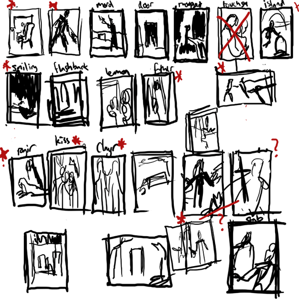
When I was trying to decide what to do I made a bunch of super-quick thumbnails from different scenes in the book I was interested in. I then narrowed down the total 12 (or 11, since I missed a week) that I'll have done in the end...super hard, there's so much cool stuff! I don't think I'll give anything away by posting these because my sketching and handwriting probably look like chickenscratch to anyone else:


I was still struggling between drawing Sabriel and the Mordicant, or something involving Mogget at Abhorsen's house, OR the scarier form of Mogget Sabriel encounters a bit later on...I decided not to do the Mordicant, since it will show up in an illustration later, so I thought maybe the Free Magic version of Mogget would be fun (he's kind of a big lighting-monster!) I ended up with this color sketch:

But the colors weren't working, and the pose was so-so after a million revisions and I was just feeling stuck. I decided to set it aside and try a different subject. However, in the process of making this sketch I had to work out Sabriel's Abhorsen outfit. As I've pointed out before, I really love researching into illustrations and I wanted to be accurate to the book's description of her wardrobe as well as realistic to similar medieval counterpoints. Here's the different pieces of the outfit, in the order they are layered:
*A thin cotton-like undergarment
*Baggy drawers
*Linen shirt
*Doeskin tunic
*Supple leather breeches, reinforced with hard segmented plates at the thighs, knees and shins (and a padded bottom for riding)
*Long armored coat, buckled at sides--knee-length split skirts, swallowtailed sleeves, made of interlocking ceramic/stone plates, like a fish's scales.
*Hobnail boots (guessing they came from Ancelstierre since they're more modern)
*Blue surcoat with embroidered silver keys
*Sword belt and bandolier, with a helmeted turban

Whew! Lots of stuff, eh? Well, in the end a lot of the layers wouldn't fully be shown, like the tunic or shirt, but I like the idea of knowing that they all exist and what they look like together. Here's my sketchy thoughts:
Because I was lazy I didn't put the keys on the surcoat or the plates on the armored coat on the right hand side
I made sure the armored coat and the surcoat were split up the front and the back, because side slits (though sexier) are of no use when riding a horse, and the book points out that her pants are padded for riding. Medieval surcoats in general seem to be sleeveless, or have very short sleeves (probably so they don't get caught while you're flingin' your swords) so the sleeves of her armored coat would be sticking through--probably with a bit of her linen shirt showing at the neck and wrists. I also kept the neck of her doeskin tunic up high, for a bit of extra protection around her neck where the armored coat might chafe. I think the idea of the pants are pretty cool with the sewn in armored plates, even though they're not seen much--it made me think of the overlapping layers of a samurai's armor. Hobnail boots seem to come up around the mid-calf region, so plating in the pants would have to end around there.

I decided not to have Sabriel at all in this month's piece, but at least my rough guide will be helping me in illustrations to come!
Instead, I was charmed by the idea of taking a break and giving Mogget & Abhorsen's House their own illustration. I did many bad sketches, or starts-of-sketches. Some of them started working better:
Mogget by the front door, Mogget in the study, Mogget at the end of Sabriel's bed
Abhorsen's house with Mogget at the front door
I liked the close-up drawings of Mogget that I did, but I thought drawing the house's exterior and doing something brighter and more architectural would be a nice counterpoint to the figure-dominated pieces I've been doing. Plus, I like looking for excuses to use the white of the paper in a spot-type piece, and the whitewashed exterior of the house would be perfect for that. (We have a great Battaglia book here that's a big inspiration for that sort of style). I wanted the house to be a safe-haven (and typical of mishmash medieval architecture), but still a little ominous. Here's the resulting final:


Geez, if you guys stuck around and read even half of that you deserve a pat on the back!! I always really appreciate your comments, and if you want to weigh in on the outfit or Mogget or how I write too much I would encourage it. :)

SABRIEL, as always, is copyright Garth Nix.

Wednesday, May 26, 2010

Mass Appeal

So for the April issue of Air Tran GO!, I did a couple illustrations for an interesting article on the power of crowdsourcing. Otherwise known as THE HIVE MIND!!
When I got the job, it didn't take long for me to get a sense of what I wanted to do--something vaguely reminiscent of a 1960's science textbook style, with bright overlapping colors and simple linework. GO! wanted some space for text within the illustration--the perfect spot for a giant lightbulb, given the illuminating qualities of the article (hohoho). Because I already had the general idea of what I wanted to do, all my sketches were variations on a theme:


And thus the final and spot:


Thanks for stickin'around! See you guys at the end of this week for some Sabriel work with a kitty innit! ALSO if you're interested in LOTR or the Hobbit (or just some sweet artwork based on it), check out this great blog post Irene Gallo put up on Tor.com, with a bunch of great artists and interesting contributions (including Sam!)