

Meet my new favorite drawing!
A while back I was contacted about contributing to 1200 posters--a project about community that features a new artist & poster each month, using quotes from Margaret Wheatley's "Turning to One Another".
I haven't had a chance to do a poster in a loooong time, and Robyn Ng & Greg Kozatek, my art directors, were pretty open to whatever idea I wanted to draw. (woohoo!)
The poster is limited to an edition of 100, only $25 each, and you can read more/buy/check out the other posters here! In my artist statement there I talk a little about the importance of the illustration community (which includes you guys!) & some of the ideas behind my poster.
If you are interested in hearing me ramble more about process, read on!
The quote I was given:
"Invite everyone who cares to work on what's possible"
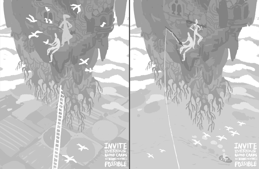
This put me in mind of intrepid adventurers, and since the theme was so open I ended up deciding to try and combine a lot of the stuff I love into one image:
*Secret, hidden places
*Trees, plants, moss
*mAgIc/fAnTaSy
*Adventure!
*Ruins
*Cats
*Old-timey explorers
*Birds, why not
My brain-funnel turned these things into an idea for a floating island/garden. Anytime I think of floating islands I think of Laputa (which is fine with me since Miyazaki is a god) but I figured that since the comparison would likely be drawn I definitely wanted to make this MY island with my spin on it.
The corresponding sketches:
Also, in a fit of worry that my floating island didn't fit the theme well enough & people wouldn't want to buy a poster of a sky rock, I did some sketches for a pretty girl poster too:

BUT Robyn & Greg liked the island and suggested that the type be integrated more and that the island look more like a nest that a bunch of people (and birds!) have built. So, we came to these options:

The sketch that was decided on takes some elements from each-- type in the background fields, thatching around some areas of the island, and some more homey touches like a clothesline, windows, etc.
From there I tried to work out a color sketch, which is probably one of the most important stages for me. Because I don't render out a lot of things in my work, I feel like I have to get the colors JUST RIGHT or else the image won't stand up. Also, since I work entirely digitally, once I get the color sketch right the rest of the work for me is just refining/polishing/redrawing straight in the color sketch until final.
This poster taught me that green is a heckuva difficult color to use well, and there's a reason why I don't often use it! Just a real pain. At least it feels damn good when you finally figure out a usable solution. Here's the general progression of the color that took me several embarrassing days to puzzle out:

no way

barf!

Finally!
I got pretty frustrated along the way and ended up looking at examples of other people using green well, then I extrapolated for my own purposes. I use reference for my drawings all the time, it makes sense to use color reference too.
As difficult as it was figuring out how to put a green island on top of green fields in the background, I was really happy to be drawing those background fields. They remind me of my family, some of whom used to be or still are farmers in Illinois. Another something I love in a poster full of things I love!
Anyway, here's a shot of the piece when it was aaalmost done. You can see there's some areas yet to be completed-- upper right, floating rocks, roots, text, etc. With this piece I did a lot of skipping around to ensure everything was worked up around the same speed:

The final is up at the top. Here's some closeups:


WHEW. While working on this, I realized that I need to work on drawing interesting characters, I don't feel as inspired drawing people anymore. Maybe it's like when every 7 years your body's cells totally renew and your tastebuds change? I've switched over to only wanting to draw backgrounds. Weird.
Thanks for reading, pals!!
18 comments:
I love this one, Kali. It reminds me of spending summers reading YA fiction and dreaming of places I'd love to explore. Great work!
Beautiful work!
gorgeous stuff.. i am such a big admirer of you style.
wow, beautiful work! I like your stuff
Amazing poster! Are they signed editions?
soooo awesome! luffff it
I look forward to ever blog post of yours and I save pretty much every piece you post for later reference. This poster is just amazing. Thank you for inspiring me.
Thanks so much, guys!! You are too nice! :D
Kyle-- Me too. Haha, I wish I didn't have all these adultish things to do and could just sit in a tree and read books again!
DavidM-- Unfortunately not. They are numbered, though! (and if you ever run into me I'd love to sign it!) ;)
Mike Laughead-- Wow, thanks Mike! You are too kind, and talented, and very welcome.
HOLY MOSES.
I think this is my new favorite drawing, too. Man. I love everything about this. Color, composition, treatment...
Really inspiring. You knocked it out of the friggin' park.
This is just breathtaking! The greenery feels so lush! I love the little circular window towards the bottom of the rock. Someday I hope I'll live in a house with circular windows...though maybe a house with a shorter commute back to the ground than this one !
IM speechless!!!
Wow! Thank you for sharing your process and thoughts! It is an awe inspiring illustration.
I just discover your work and WOW !
I really love it, plus, the process you show is really inspiring, you make me want to draw like hell !
Thanks
yeaaa! amazing stuff kali, not just this one, all around
This is fantastic!
You're so right about finding green difficult. I have the same trouble with red. It is super hard to adjust the values and maintain the richness of the colour. Green flat out turns a different hue if you try to lighten or darken it, making things often feel inconsistent.
Having said that I think you've done a wonderful job here in this piece. :)
Agen Judi Online
Agen Judi
Agen Judi Terpercaya
Agen Bola
Bandar Judi
Bandar Bola
Agen SBOBET
Agen Casino
Agen Poker
Agen IBCBET
Agen Asia77
Agen Bola Tangkas
Prediksi Skor
Prediksi Skor LIVERPOOL VS ASTON VILLA 26 September 2015
Prediksi FC NANTES VS PARIS SAINT-GERMAIN 26 September 2015
It's my new favourite too! Brilliant work. Apologies if I've missed it in the text but where can I buy this poster now?
Thanks, Tom Myfield
http://blogfolio.runninghead.com/
Post a Comment